A DSA Website is a primary marketing tool for its distributors and customers for putting a lasting first impression for the potential buyers, i.e thier primary distributors. Hence, the objective of the DSA website redesign case study was to enable easier browsing and to help users find relevant content asily, while still preserving the purpose and information from the existing pages.
A Simple yet clean & modern interface would allow creating awarness, trust and credibillity among visitors for the institution using content and online visibility.
Challenges
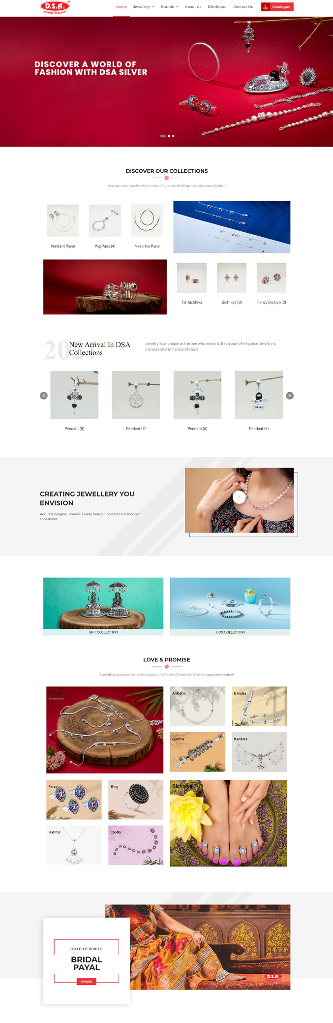
User-friendly, easy to navigate, interactive & modern are not the words that would come to our minds when we see the current DSA main website. The site is outdated, content is not well managed ie. lots of information but no real emphasis or hierarchy within them and has alignment issues & inconsistencies in design throughout the pages.
Key points for
Re-Designing the
Website
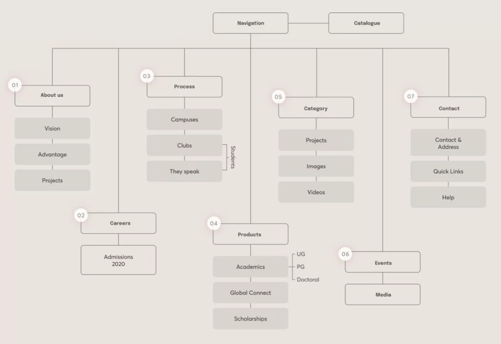
Improving the overall site architecture and navigation
Removing a lot of repetitive information, to get out there a crisp and clean content.
Creating a brand identity. Hence, increasing its credibility.
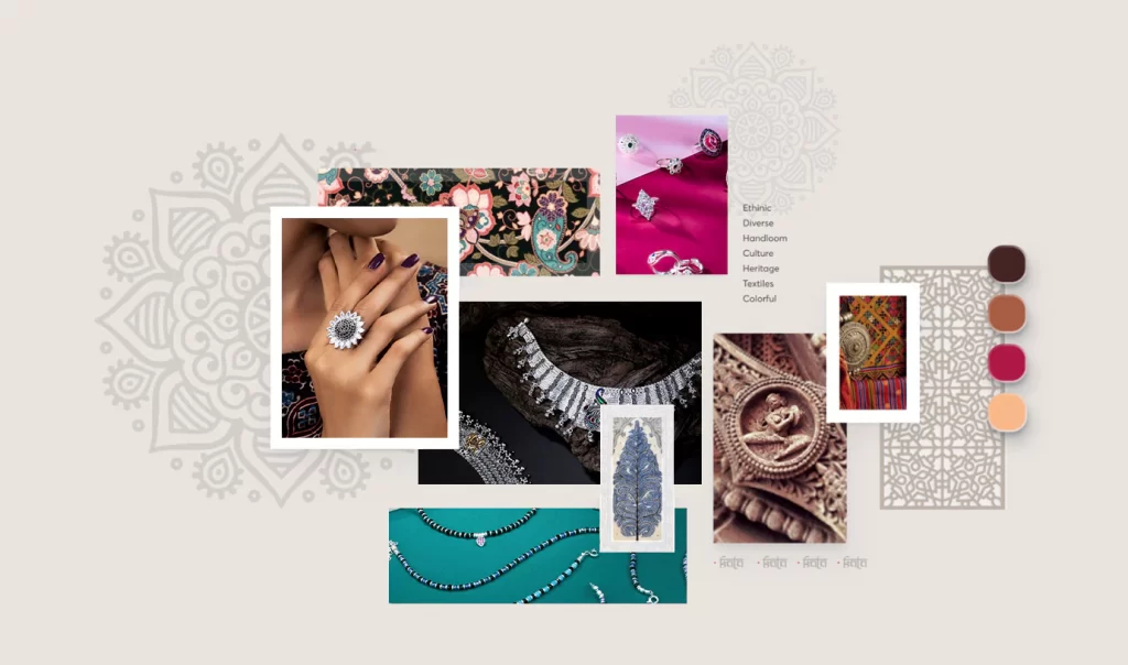
Modern interface design with a hint of a traditional touch, which visually depicts what the collage stands for.
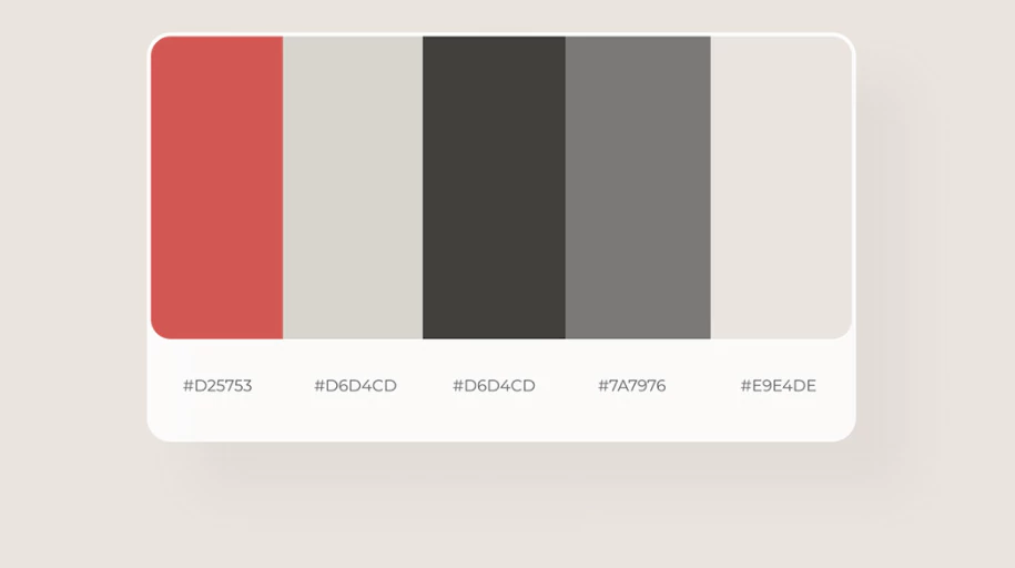
Colors
Moodboard
Sitemap
Current Design
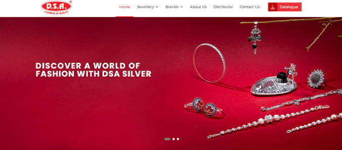
1. Stretched Hero images 2. Lot of information in one Section, hence difficult on boarding 3. Lack of white spce
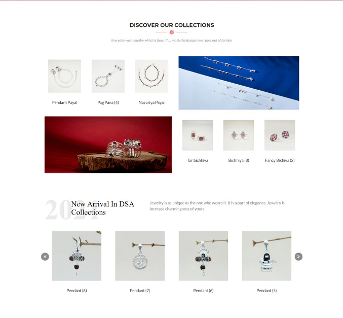
1. Text not Visible ininformation cards 2. No proper indication of the box being cards with action links 3. Very little margin within the text and the box.
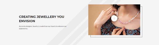
1. Video to engage the user 2. Its shows the process of jewelary making to engage and appriciate the craftman ship and and hard work that customer paying for
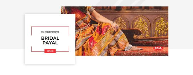
1. Consistent layout 2. Action button on the cards for easy navigation
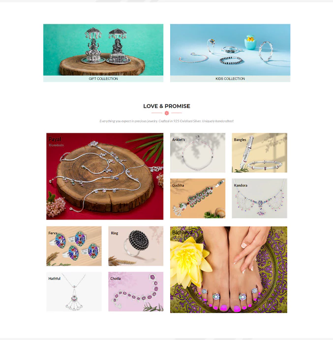
1. Vertical Rhythm 2. Flat and cluttered visual appearance having enough depth to separate the layer for the background
Current Design
1. Stretched Hero images 2. Lot of information in one Section, hence difficult on boarding 3. Lack of white spce
1. Text not Visible ininformation cards 2. No proper indication of the box being cards with action links 3. Very little margin within the text and the box.
1. Video to engage the user 2. Its shows the process of jewelary making to engage and appriciate the craftman ship and and hard work that customer paying for
1. Consistent layout 2. Action button on the cards for easy navigation
1. Vertical Rhythm 2. Flat and cluttered visual appearance having enough depth to separate the layer for the background